Software Feature
Pie Charts
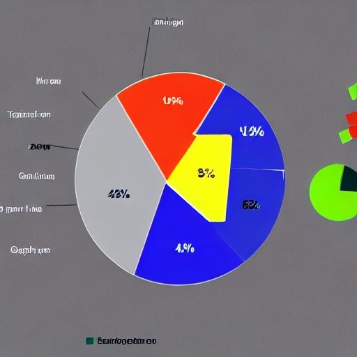
Pie Charts: Visualizing Data Distribution with Circular Graphs
Pie charts are a powerful graphing software feature that visually represents data distribution using a circular graph. They provide a clear and intuitive way to showcase the proportionate distribution of different categories within a whole.
Visual Representation
Pie charts use slices or sectors of a circle to represent different categories or data points. The size of each slice corresponds to the proportion of that category relative to the whole. The slices’ circular shape and visual angles make it easy to compare and interpret the relative sizes of each category.
Data Distribution Analysis
Pie charts help analyze data distribution by highlighting the percentage or proportion of each category. They let viewers quickly identify the largest and smallest categories and understand the overall distribution pattern. This visual representation aids in identifying trends, patterns, and disparities in data.
Effective Communication
Pie charts are an effective communication tool as they simplify complex data by presenting it in a visually appealing and easily understandable format. They can be used in various fields, such as business, finance, marketing, and research, to convey information, support decision-making, and enhance presentations.